The Complete Guide to Collections on Kollectia
By Olika
Kollectia — Collections User Guide
A walkthrough of how Collections work in Kollectia: organizing your collection, the
parent/child hierarchy, custom fields, privacy, importing data, and the
everyday flow of using a collection.
Table of contents
- Core concepts
- The Collections list (
/collections) - Creating a collection (
/collections/create) - Viewing a collection (
/collections/{id}) - Editing a collection (
/collections/{id}/edit) - Importing items (
/collections/import) - Subcollections in practice
- Tips & troubleshooting
1. Core concepts
Before diving into the UI, it helps to know the three building blocks every
page in Kollectia revolves around.
| Concept | What it is | Example |
|---|---|---|
| Collection | A container that groups related things together. | "Vinyl Records", "Magic: The Gathering" |
| Subcollection | A collection that lives inside another collection. Collections can be nested as deep as you need. | "Vinyl Records → Jazz → 1960s" |
| Item | A single thing inside a collection (the actual collectible). | A specific record, a single card, one figurine |
| Template | A reusable blueprint for a collection — name, icon, and a pre-built set of custom fields. | "Trading Cards", "Comic Books", "Video Games" |
| Custom field | A piece of information you want to track on every item in a collection (year, grade, price, image…). | "Year (1959)", "Condition (Near Mint)", "Price ($120)" |
The hierarchy at a glance
You (account)
└── Collection: "Vinyl Records"           ← top-level (no parent)
    ├── Subcollection: "Jazz"
    │   ├── Subcollection: "1950s"
    │   │   ├── Item: "Kind of Blue – Miles Davis"
    │   │   └── Item: "Time Out – Dave Brubeck"
    │   └── Subcollection: "1960s"
    └── Subcollection: "Rock"
        └── Item: "Abbey Road – The Beatles"
Key rules:
- A collection has ** one parent**, but can have many children.
- An item always belongs to ** one** collection (its direct parent).
- Custom fields are defined per collection. Subcollections don't
automatically inherit fields from their parent — each level can have its own
structure, which makes deep hierarchies very flexible. - Visibility (Public / Private / Friends only) is set per collection and
per item. Items can be set to Inherit from their collection.
2. The Collections list (/collections)
This is your home base. Everything starts here.
What you'll find:
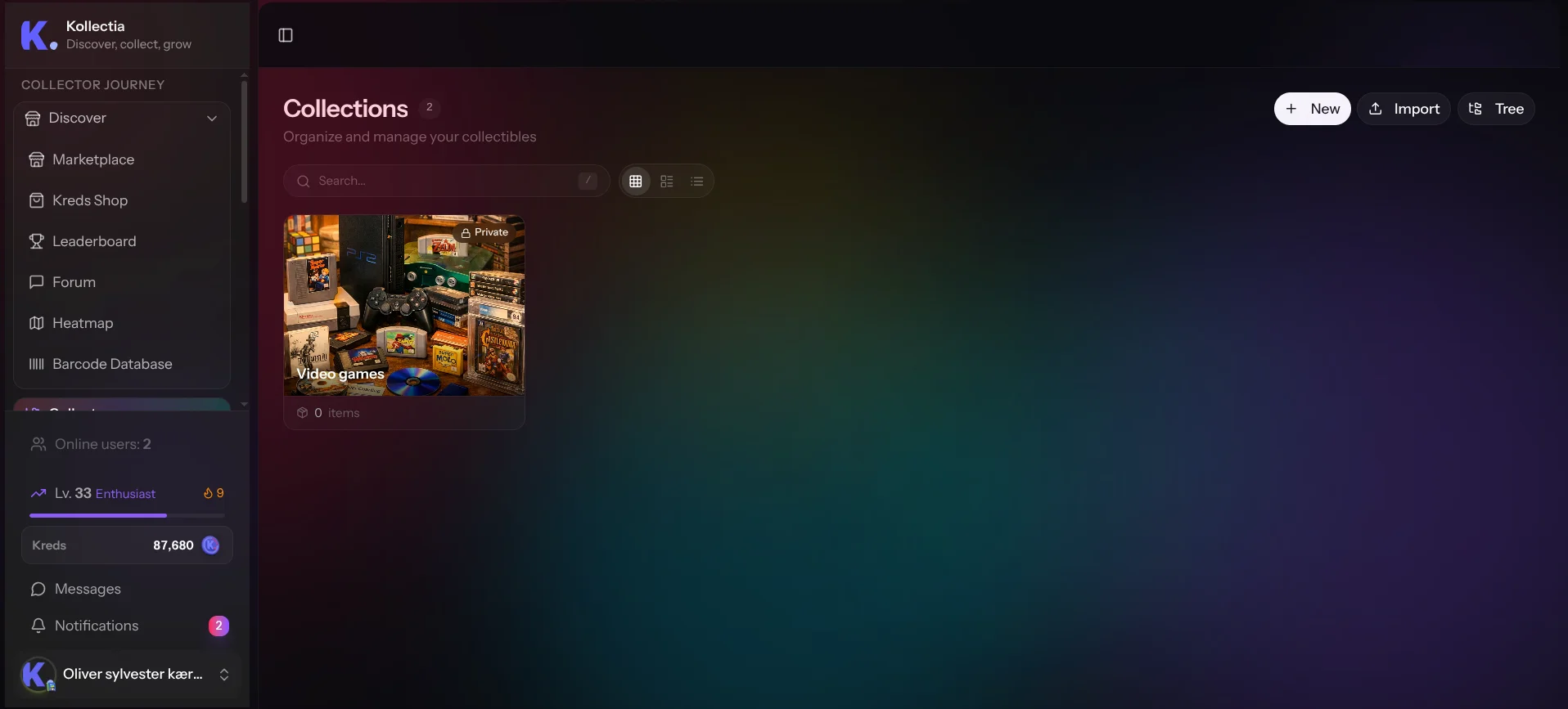
- Header — the current location (either "Collections" at the root, or the
name of the collection whose subcollections you're browsing) and a counter
showing how many collections are visible. - New — opens the create-collection form. If you're inside a subcollection
view, the new collection is automatically created as a child of it. - Import — opens the CSV import wizard (see §7).
- Search bar — keyboard shortcut: press
/anywhere on the page to
jump straight to the global search dialog. - View toggle (top right) — switch between Grid, Table and
Compact list. Your choice is remembered per device. - Collection cards — clicking a card opens the collection. Each card
shows the icon, color accent, name, item count, and number of
subcollections.
If you have no collections yet, an empty-state encourages you to create one.
3. Creating a collection (/collections/create)
Open this page either from:
- Collections → New (creates at the root, or inside the current
subcollection if you opened it from one), or - Collections → some collection → New subcollection (creates as a child).
The page is one long form, broken into collapsible sections. Required fields
are marked with *.
Recommended flow banner
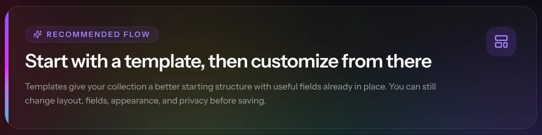
At the top a violet banner reminds you of the recommended flow:
Start with a template, then customize from there.
You don't have to use a template, but starting from one saves a lot of
time — and you can still rename, add, or remove fields afterwards.
3.1 Choose your starting point — Templates
This section is open by default on create (and collapsed by default on edit).
- Select Template — a searchable dropdown. Templates are curated
structures (e.g. "Trading Cards", "Books", "Video Games"). Pick
whichever closest matches what you collect; you'll be able to tweak it. - After picking, a preview card appears showing the template's name,
description and the list of fields it brings in.
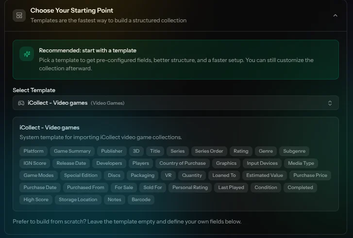
Notes:
- Selecting a template auto-fills the icon and pre-populates the
Custom fields section. - Selecting "(no template)" or clearing the choice on create resets the
fields back to empty. - On edit, changing the template updates the available fields but does
not delete data that's already saved on items — values for removed fields
simply stop being shown until you add the field back. - Prefer to build from scratch? Leave the template empty and use the
field builder directly.
3.2 Basic information
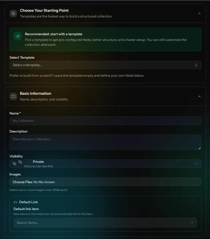
| Field | Required | What it does |
|---|---|---|
| Name | ✓ | The display name (and the basis for the public URL slug if the collection is public). |
| Description | Free-text. Markdown is rendered when viewing the collection. Use it for context, rules, or links. | |
| Parent collection | (Edit only) Move the collection under a different parent, or up to root. | |
| Visibility | ✓ | Public / Private / Friends only. See §4.3. |
| Cover images | Upload one or several images used in headers, cards, OG/social previews. | |
| Default link | Set a default related-item link (e.g. "Part of") that new items in this collection will use. See §4.5. |
3.3 Visibility (privacy)
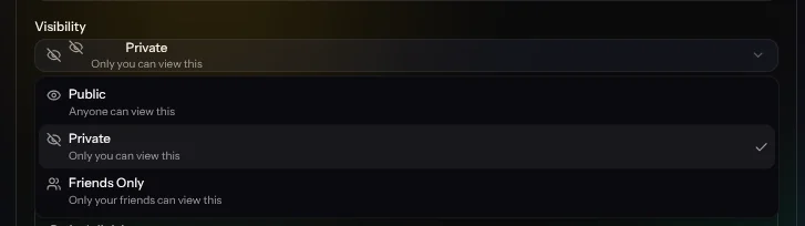
| Option | Who can see this collection |
|---|---|
| Public | Anyone, including non-logged-in visitors. Shows up in search and on public profiles. |
| Private | Only you. Default for new collections. |
| Friends only | Only accounts you're friends with on Kollectia. |
When you later create items inside the collection, items have the same three
options plus an "Inherit" option — which uses whatever the collection is
set to. This lets you set the rule once on the collection and forget about it.
3.4 Cover images
- Drag-and-drop or click to upload.
- Multiple images are allowed; the first one is used as the main cover.
- On edit you can remove existing images individually; uploads are added on
top of what's already there.
3.5 Default link
Kollectia lets items reference other items via typed links — e.g.
"part of", "variant of", "owned by". When you set a default link
on a collection, every new item created in it can be linked to the chosen
target with that relationship in one click.
Common uses:
- A "Cards from 2023 Set" collection linked to a parent set item.
- A "Variants" collection linked to its base card.
You can change or clear the default link from the collection's edit page.
3.6 Custom fields (the field builder)
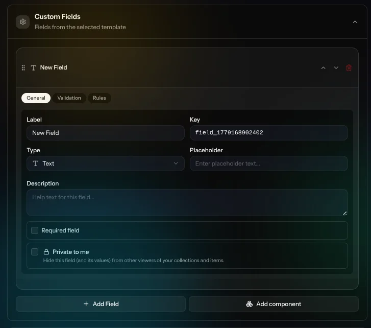
This is the heart of Kollectia — it's how a "collection" becomes a real
inventory tool instead of a folder.
How it works
Every collection has a list of field definitions (e.g. "Year", "Grade",
"Price"). When you create or edit an item in that collection, those fields
appear on the item form — so every item in the collection captures the same
structured data. That data is then searchable, filterable and sortable on
the collection page.
Adding a field
- Click Add field.
- Give it a label (the field key is generated automatically).
- Pick a type. Available types:
| Type | Use it for |
|---|---|
text |
Short single-line text |
textarea |
Longer free text |
number |
Numeric values |
currency |
Prices (with currency symbol) |
slider |
Numeric value via slider (e.g. 1–10 scale) |
rating |
Star rating |
checkbox |
Yes/no (true/false) |
date |
A date |
datetime |
A date and time |
select |
Pick one option from a fixed list |
multi_select |
Pick several options from a fixed list |
tags |
Free-form tags |
url |
A web link |
email |
An email address |
phone |
A phone number |
color |
A color picker |
image |
One image |
images |
Multiple images |
location |
A geographic location |
barcode |
A barcode (great with the mobile scanner) |
component |
A group of fields — see "Components" below |
Per-field options
For each field you can configure:
- Required — must be filled before saving an item.
- Filterable — appears as a filter on the collection page. (Supported
for select, multi_select, tags, rating, number, slider, checkbox, currency
and a few others.) - Sortable — appears as a sort option. (Supported for text, number,
rating, slider, currency, checkbox, date, datetime.) - Private — value is only visible to you, the owner, even on a public
collection. Useful for purchase price, storage location, etc. - Default value, placeholder, description (help text) and an
icon. - Options list for
select/multi_select. - Rules — declarative validation like "required when other field has
value X", "min/max items for repeatable groups", "unique within the item
or user".
Reordering and removing
- Drag the handle on the left of each field to reorder.
- Click the trash icon to remove a field.
Heads up: removing a field from the collection doesn't physically erase
the data already saved on items — but the value stops being shown and edited
in the UI. Re-adding a field with the same key brings the data back.
Components (grouped & repeatable fields)
The component type lets you nest a group of fields. Mark a component as
repeatable and you can add multiple instances of that group on each item.
Use cases:
- A "Grading" component with sub-fields (grader, grade, certificate number)
that can appear multiple times for items graded by several houses. - A "Sale history" component with date and price, repeatable.
You can also configure min/max number of instances and conditional
visibility via rules.
3.7 Appearance — icon, color & column designer
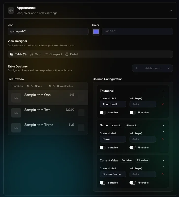
- Icon — any emoji works (e.g.
📀,🎮,🃏). Templates pre-fill this. - Color — color picker (with hex input). The chosen color shows up as
accent gradients on cards and the collection header. - Column designer — choose which custom fields are shown as columns in
the Table view of the collection, and the order they appear in. The
live preview uses real sample items so you can see what it will look like.
3.8 Saving — Create / Create & add another
The sticky bar at the bottom of the form has two actions when creating:
- Create Collection — saves and takes you to the new collection.
- Create & Add Another — saves and immediately opens a fresh create form
with the same parent context preselected. Perfect for setting up several
subcollections in a row.
On edit, the bar shows Save Changes plus a destructive Delete button
in the page header that requires confirmation.
4. Viewing a collection (/collections/{id})
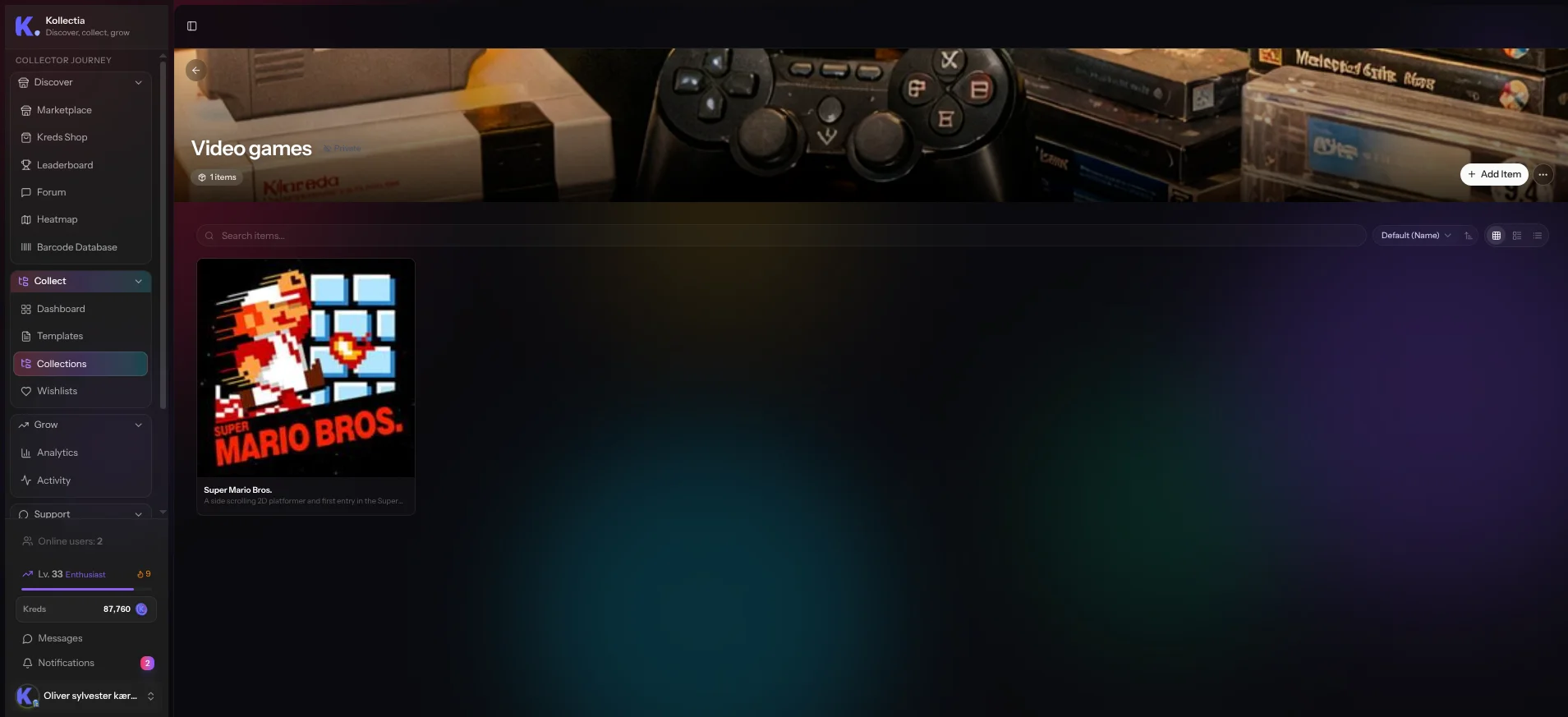
This is where you actually use a collection day-to-day.
Layout, top to bottom:
- Hero header with cover image, icon, name, description, item counts,
privacy badge, and owner actions (Edit, Import items, Add item, Delete). - Template strip (if built from a template) — a quick link back to the
template page. - Subcollections grid — children of this collection. Click one to drill
down; the breadcrumb at the top updates as you go. - Toolbar:
- Search — searches items by name and custom field values (debounced
for performance). - Sort — only fields you marked as sortable show up here, plus
ascending/descending toggle. - View toggle — Grid / Table / Compact. The Table view uses your
column designer choices.
- Search — searches items by name and custom field values (debounced
- Filters bar — populated from fields you marked as filterable. The
collection only re-fetches when filters actually change. - Items area — paginated. Cards/rows show the fields you chose to
display.
Owner-only actions appear when you own the collection: Add item, bulk
delete, reorder (drag to rearrange items), import, edit, delete.
Public URL — if the collection's visibility is Public, it's also
reachable at /c/{slug} for sharing.
5. Editing a collection (/collections/{id}/edit)
The edit form reuses the exact same sections as the create form, with a few
differences:
- Template section is collapsed by default (you usually don't touch it
on edit). - A Parent collection dropdown is exposed under Basic Information so you
can move the collection under a different parent or back to root. - Existing images show with remove buttons; new uploads are appended.
- The page header includes a Delete action with confirmation —
deleting a collection also deletes all its subcollections and items.
Editing custom fields on an existing collection is safe: changes update the
schema for new items immediately, and existing item data is preserved.
6. Importing items (/collections/import)
A 4-step wizard for getting data in from a CSV or spreadsheet:
- Upload — drop a
.csv(or supported spreadsheet) file. - Collection — choose to import into an existing collection or have
Kollectia create a new one from the file. Optionally, let Kollectia
auto-suggest field definitions from the CSV headers. - Mapping — map each CSV column to a custom field on the collection.
You also choose a duplicate handling strategy here (skip, update,
create new). - Import — progress is streamed in real-time; you'll see how many rows
succeed and any errors row by row.
When done you're taken to the collection with the new items already loaded.
7. Subcollections in practice
Some patterns that work well:
- By era / set / season — e.g. video games grouped by console, then by
year. - By status — e.g. "Owned", "Wanted", "For sale" as siblings.
- By location — e.g. "Storage box 1", "Display shelf".
- By franchise — useful for trading cards and figurines.
Reminders:
- Subcollections can each have their own custom fields that differ from
the parent. This is intentional — a "Graded cards" sub can have grading
fields the parent doesn't. - Use the column designer at each level to keep the table view tidy
when fields differ. - Deep nesting works but can be hard to navigate — the global search (
/)
is your friend.
8. Tips & troubleshooting
"My field doesn't appear as a filter."
Check the field type — only filterable types (select, multi_select, tags,
rating, number, slider, checkbox, currency, …) can be filters. Then make
sure you ticked Filterable on the field.
"I changed the template and my data disappeared."
It hasn't — the field was removed from the visible schema, not deleted. Add
a field back with the same key and the values come back.
"Items I imported show no images."
Image columns in CSV import must contain direct URLs to publicly accessible
images.
"I want to share one collection publicly but keep the rest private."
Visibility is per collection (and per item with Inherit). Set just that one
collection to Public; everything else stays Private by default.
"How do I move an item to a different collection?"
Open the item, use the Move action (or the kebab menu in lists). For
collections, use the Parent collection dropdown on the edit page.
Mobile
The entire flow — list, create, edit, viewing items — is built
mobile-first. On small screens, sections of the create form become more
compact and the sticky save bar stays pinned at the bottom so you can
submit without scrolling.
Last updated: 2026-05-19.